
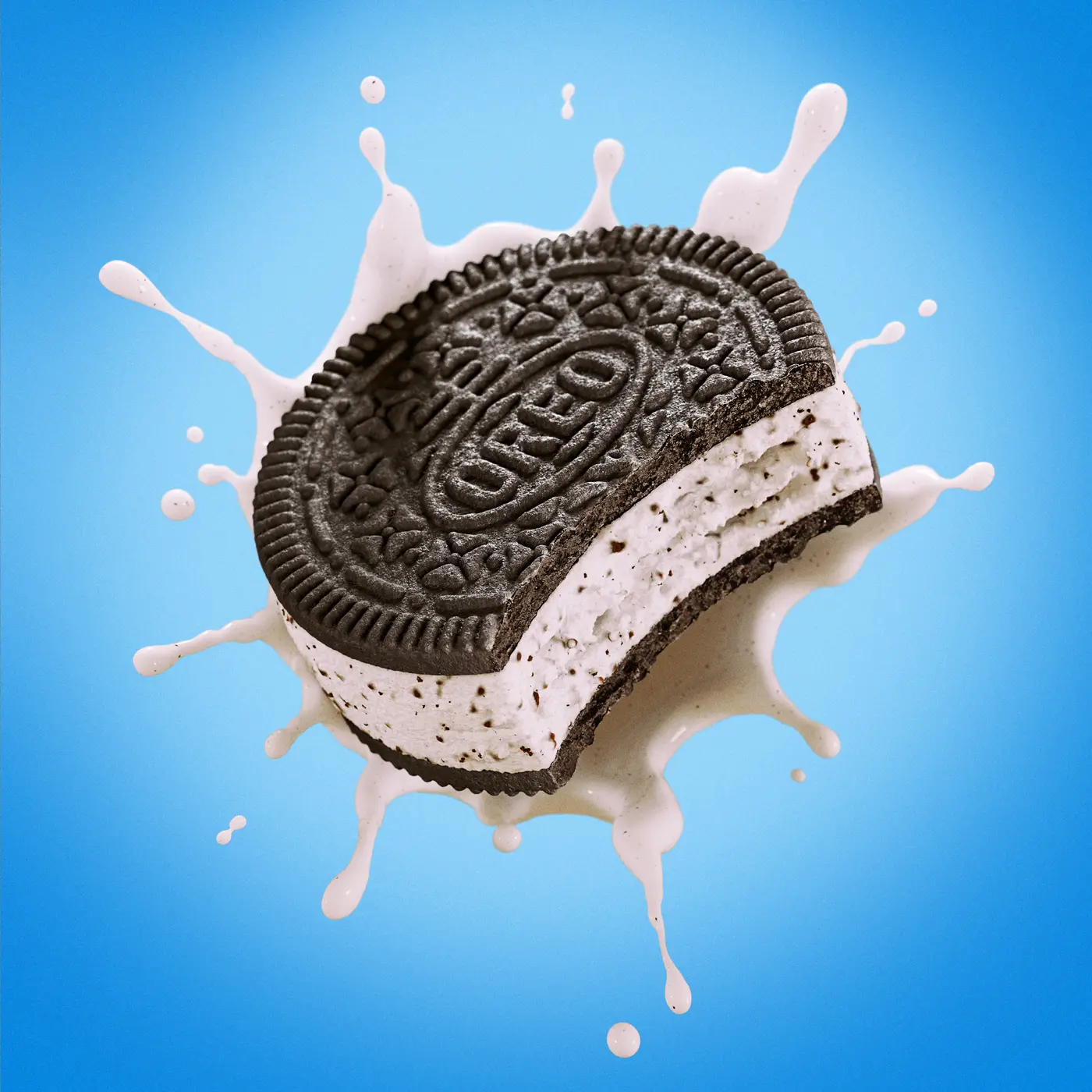
For CPG brands, a product image has a job to do before anyone reads the headline around it. It needs to make the product recognizable, communicate what is appealing about it and fit naturally within the brand's visual world.
That is why an effective product visual cannot be measured only by how polished or realistic it looks. A beautiful image can still be unclear, difficult to adapt or disconnected from the way a product is actually positioned.
3D CGI gives brands a controlled way to build product visuals around a clear communication goal. The product, materials, camera, lighting, composition and surrounding ingredients can be developed as parts of the same visual system.
This article looks at what makes a product visual effective for food and consumer brands, and how CGI can help teams create images that are easier to understand, more desirable and more useful across channels.
The examples in this article come from selected GS Creative 3D food CGI projects.
Effectiveness is more than visual polish
A product visual can be technically impressive and still fail to communicate. It may have beautiful lighting but hide the most important product detail. It may be rich in ingredients and atmosphere but leave the product format difficult to understand. It may look premium in isolation but feel unrelated to the brand that needs to use it.
An effective visual connects appearance to purpose. It makes the right detail visible, gives the product a convincing presence and guides the viewer toward the intended interpretation.
For one brand, that may mean making a filling feel generous and indulgent. For another, it may mean showing a precise shape, a distinctive coating or a clean relationship between product and packaging. The visual answer depends on the product promise.
CGI is valuable because these decisions can be designed together. The image is not limited to what happened to be available in a photo session. It can be built around the message the product needs to deliver.
Give the image one clear job
The most effective product visuals begin with a clear question. What should the viewer understand or feel first? Is the image introducing a new format, communicating flavour, showing texture, supporting a premium position or helping a product stand out in a crowded category?
When an image tries to communicate everything at once, its hierarchy becomes difficult to read. The product competes with ingredients, the background competes with the product and the viewer has to work too hard to find the intended message.
A clear visual job does not make the image predictable. It gives creative decisions a direction. Once the priority is defined, the team can decide how much detail, contrast, movement and negative space the composition really needs.
This also makes feedback more useful. Instead of asking whether an image simply feels better, a team can ask whether the product is more legible, the texture more appetizing or the brand position more convincing.
Make the product understandable at a glance
Recognition is the first condition of an effective product visual. The viewer should be able to understand what the product is, what makes it distinctive and where attention should go without needing a long explanation.
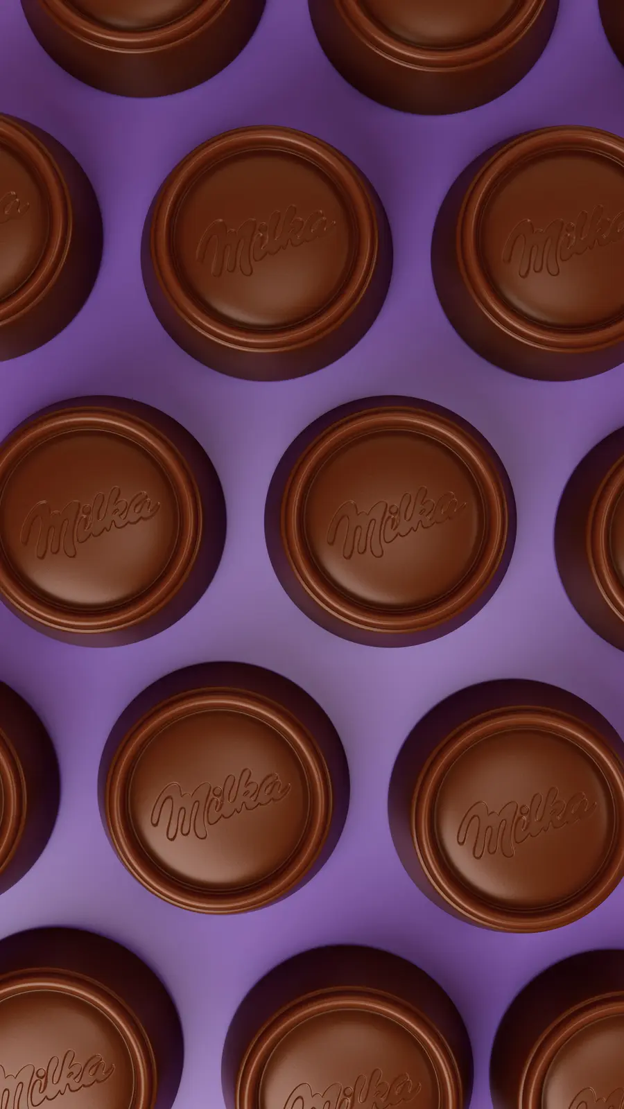
Form, scale and silhouette play an important role. A sandwich cookie, a filled biscuit and a chocolate tablet each require a different visual emphasis. The camera angle should reveal the characteristics that distinguish one format from another rather than reducing every product to the same generic hero shot.
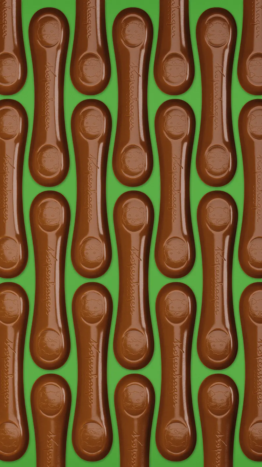
The same applies to a range with multiple variants. If the images share a common visual language, the products can feel connected without becoming indistinguishable. Small differences in colour, filling, texture or ingredient cues can establish a clear family structure.
3D makes it possible to test these relationships before committing to a final image. The team can adjust proportion, crop, camera height and spacing until the product reads quickly and confidently.
Use material and contrast to communicate the promise
Food products are understood through more than shape. The surface, density, break, filling and response to light all influence what the viewer expects the product to feel like when eaten.
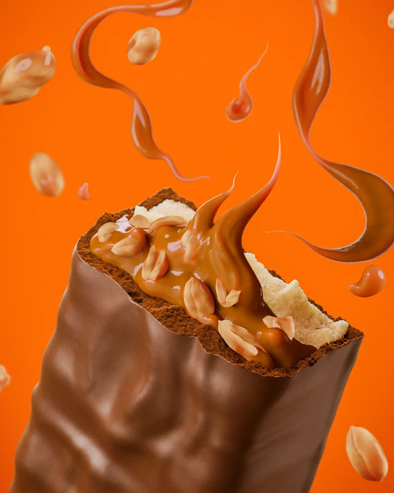
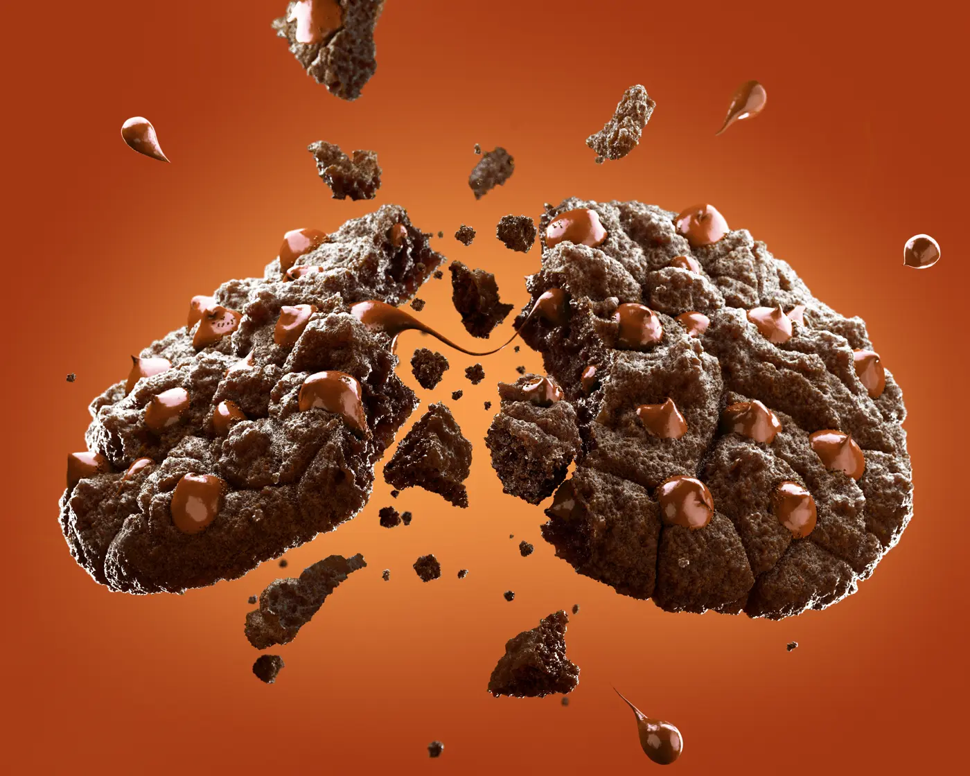
Gloss can suggest richness or a soft coating. A rougher surface can communicate crispness, baked texture or a more generous handmade quality. A clean edge can make a product feel precise, while controlled irregularity can make it feel abundant and tactile.
The goal is not to exaggerate every material equally. Too much gloss can flatten the hierarchy. Too much texture can become noise. Effective CGI gives the most important sensory cue enough contrast to be understood without overpowering the product itself.
This is where lighting becomes part of the communication strategy. Highlights, shadows and reflections can explain the structure of a product before the viewer consciously analyzes the image.
Build a visual system, not one isolated image
A CPG brand rarely needs only one product image. The same visual language may need to appear in a packaging presentation, a campaign key visual, an e-commerce listing, a sales deck and a social format.
That does not mean forcing one composition into every channel. It means creating a base asset with enough control to generate purposeful variations: a wider crop for copy, a closer detail for appetite appeal, a cleaner view for product recognition or a vertical version for mobile use.
A visual system also creates consistency across a range. Camera logic, lighting behaviour, background treatment and ingredient styling can remain connected while each product receives the detail it needs.
With CGI, these variations can come from the same scene and the same product logic. The result is not a collection of unrelated images, but a set of assets that feel like they belong to one campaign and one brand.
Design for the size and channel where the image will live
An image that works beautifully on a large screen may lose its message when reduced to a small package panel or a mobile thumbnail. Effective product visualization considers the final viewing condition early enough to protect the important details.
At a smaller size, silhouette, colour separation and one strong product cue usually matter more than subtle secondary details. At a larger size, the viewer may have time to appreciate surface behaviour, ingredient relationships and controlled imperfections.
The answer is not always to simplify the image. It is to decide which information must survive reduction and which information can remain available for closer viewing.
This is another advantage of a 3D workflow. The same product can be evaluated through different crops and distances before the final asset family is delivered, making the visual more resilient across the places where the brand intends to use it.
Use variation to test what works
A single approved image can hide uncertainty. The team may like the overall mood without knowing whether the product would communicate more clearly from another angle, with a different crop or with a more restrained background.
Creating a small set of purposeful variations makes those decisions visible. One option might prioritize the product silhouette. Another might emphasize the filling. A third might create more room for copy or show the relationship with ingredients.
The purpose is not to produce endless alternatives. It is to compare meaningful choices while they are still easy to change. Once the team understands which route best supports the product, refinement can become more focused.
In this way, CGI supports creative judgment without replacing it. The technology creates the room to test; the brand team still decides which visual most clearly represents the product and its promise.
A practical review framework for effective CGI
When reviewing a product visual, teams can look beyond personal preference and ask a few practical questions. The answers help separate a strong visual decision from an attractive detail that does not improve communication.
- Can the viewer understand the product and its distinctive feature quickly?
- Is the first point of attention the one the brand actually wants to lead with?
- Do texture, filling, coating and ingredients support the product promise?
- Does the image feel connected to the brand rather than interchangeable with a competitor's visual?
- Can the composition be adapted to the most important formats without losing its message?
- Does every visible element add meaning, appetite appeal or useful context?
The best product visual makes the product easier to choose
Effective CGI is not simply about making a product look impressive. It is about reducing the distance between what the brand wants to communicate and what the viewer actually understands.
The image should make the product feel clear, credible and desirable. It should help a consumer recognize the offer, help a marketing team present it and help a brand keep its visual language consistent as the product appears in different contexts.
That requires more than a polished render. It requires a clear visual job, a deliberate hierarchy, convincing material behaviour and enough flexibility to support the asset's real applications.
For CPG brands, 3D CGI becomes most valuable when it is treated as a visual system rather than a single image. The result is a product presence that can work harder across packaging, campaigns, digital channels and future variations.
The previous guide explored what teams should prepare before a visualization project begins. The next step is to make those inputs work together as a visual that people can understand, remember and desire.
Before developing that visual system, read What CPG Brands Need to Prepare Before Starting a 3D Product Visualization Project.
Frequently asked questions
What brands usually ask before starting.
What makes a product visual effective for a CPG brand?
An effective visual makes the product easy to understand, communicates its most important sensory or brand cue, creates desire and remains useful in the channels where the brand needs to show it. It connects visual craft to a clear communication purpose.
Can one CGI scene produce different product visuals?
Yes. A well-structured 3D scene can support different camera angles, crops, levels of detail and formats while preserving the same product, materials and visual language. This helps a brand create a coherent family of assets instead of unrelated images.
Should a product image show the ingredients around it?
Ingredients should appear when they clarify flavour, quality or appetite appeal. They should support the product rather than compete with it. The right amount depends on the visual job, the brand language and the final channel.
How can a brand evaluate whether a CGI image is working?
Review whether the product reads quickly, whether the intended detail leads attention, whether the materials support the promise, whether the image feels connected to the brand and whether the composition can adapt to the most important formats.
Is photorealism enough to make a product visual effective?
No. Realism helps create credibility, but an effective visual also needs hierarchy, positioning, appetite appeal and a clear relationship with the brand. A technically realistic image can still be unclear or strategically weak.
Need stronger product visuals?
Create a visual system around the product.
GS Creative 3D helps food and consumer brands turn product details, materials and creative goals into focused CGI visuals built for real commercial use.
Discuss a project