
A 3D product visualization project rarely begins with a perfect brief. More often, a brand has a product idea, a group of references, some packaging information and a decision that needs to be made before every detail is finished.
That is normal. The role of preparation is not to answer every creative question in advance. It is to give the 3D team enough reliable information to understand the product, the brand and the decision the image needs to support.
For food and consumer-goods brands, this preparation can make the difference between a render that is merely attractive and a visual asset that helps marketing, design, innovation and commercial teams move forward together.
This guide explains what to gather before starting a 3D product visualization project, what decisions are worth clarifying early and where a strong CGI partner can help turn incomplete information into a focused visual direction.
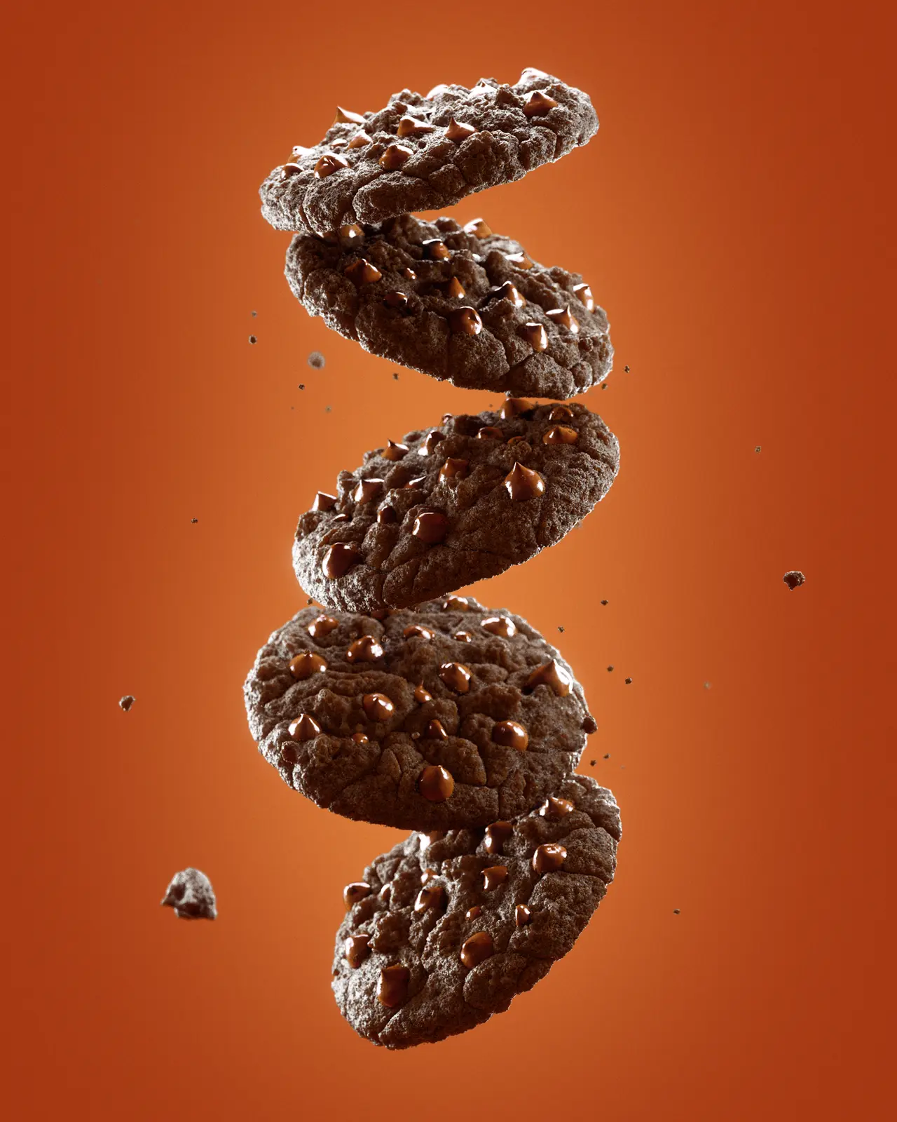
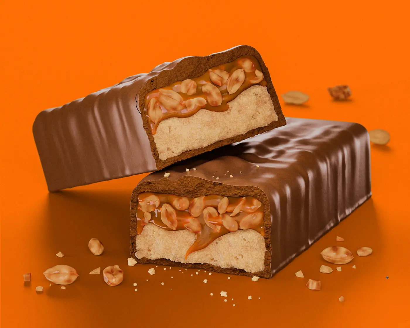
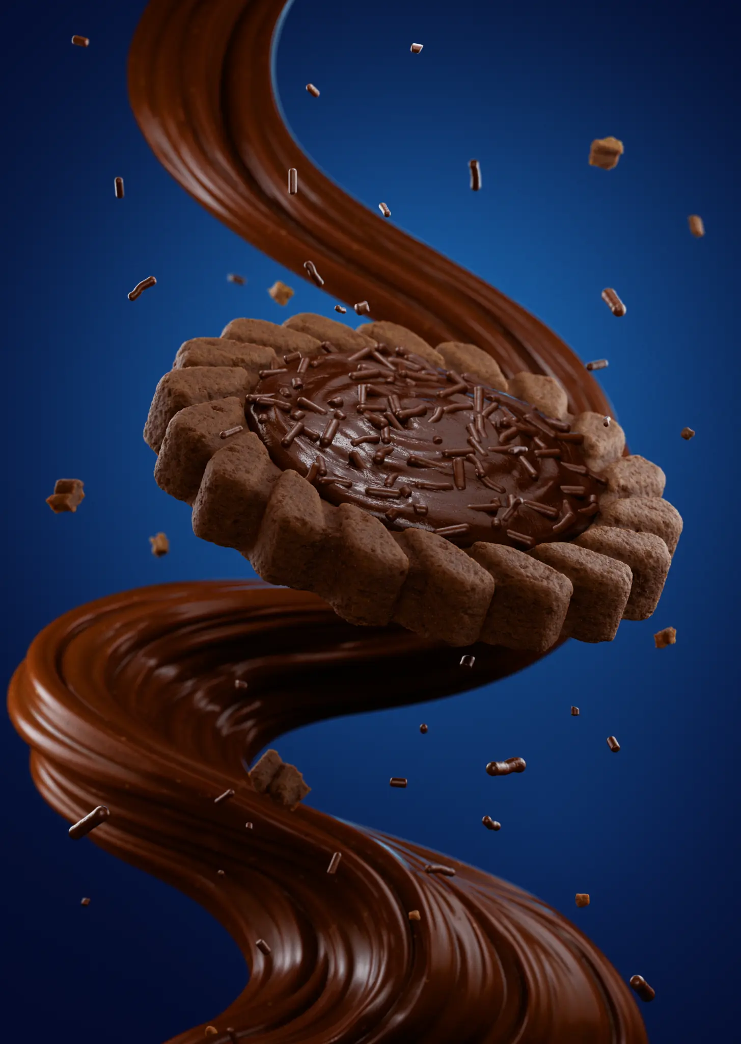
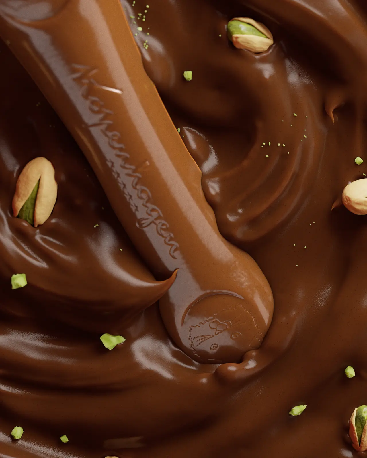
The brigadeiro biscuit images used in this guide come from a GS Creative 3D product CGI study.
A strong CGI project starts before the first image
The first deliverable in a product visualization project is not always a final render. It may be a shared understanding of what the product is, what it should communicate and which questions the image needs to answer.
When those points remain unclear, the project can accumulate avoidable revisions. A team may discover late that the product dimensions were interpreted differently, that the visual reference suggested the wrong level of realism or that the proposed image was intended for a different application.
Preparation reduces that ambiguity. It gives the artist a stronger starting point and gives the client a clearer way to evaluate each stage. The goal is not to remove creative exploration. It is to make exploration purposeful.
Start with the product, not only the final image
The most useful starting information describes the product itself. Share the product name, category, flavour or variant, dimensions, expected proportions and any details that must remain accurate.
If the physical product already exists, photographs from several angles, measurements and structural references can help establish a reliable base. If it is still in development, explain what is fixed, what is provisional and what the visualization is expected to explore.
For food products, the visual character of the surface matters as much as the silhouette. A porous biscuit, a glossy filling, a crisp coating or an irregular sprinkle pattern each suggests a different material direction. Calling out these priorities early helps the image communicate the intended eating experience without guessing at the product promise.
The more clearly the product is described, the more energy the project can spend on visual direction instead of correcting basic misunderstandings.
Collect references that explain the intention
References are most valuable when they explain why a visual direction is relevant. A folder of attractive images is a useful beginning, but it becomes much more actionable when each reference has a short note: use this light, avoid this background, preserve this sense of scale or communicate this type of texture.
Consider collecting references in separate groups for product detail, camera and composition, lighting, colour, material behaviour, ingredients and overall mood. This makes it easier to distinguish a reference for the product from a reference for the atmosphere around it.
It is also helpful to identify what should not be copied. A reference may be useful for its softness or framing even when its colour palette, props or styling do not belong to the brand. Explaining that difference gives the 3D artist room to interpret rather than imitate.
A focused reference set creates a visual vocabulary. It gives the project direction while leaving enough space for an original solution.

Share the brand's visual language
A product image should belong to the brand, not only to the category. Brand guidelines, colour information, typography, packaging artwork, previous campaign examples and approved visual references all help establish that connection.
The team does not need to have resolved every art-direction choice before the project begins. It does need to know which signals are important: a restrained premium mood, a generous and indulgent tone, a playful colour system, a natural sense of texture or a very clean and graphic presentation.
Previous brand imagery can also reveal useful boundaries. It may show how much negative space the brand usually protects, how ingredients are treated, how much contrast is acceptable or how products are framed in relation to the viewer.
This information prevents the CGI from becoming visually impressive but strategically disconnected. It helps the product feel like a new expression of the brand rather than a generic food image.
Organize packaging, product and technical information
When packaging is part of the scene, provide the artwork, dielines, logos, labels and any available structural files in the most reliable version available. If the package is still being developed, mark the files clearly as provisional so no one treats an early direction as final artwork.
The same principle applies to the product. Separate approved information from exploration. Note the dimensions that cannot change, the elements that are still being tested and the details that only need to feel visually plausible for the current stage.
File organization is a creative advantage. Clean naming, version numbers and a short list of priorities reduce the chance of working from an outdated label, an incorrect variant or a reference that was shared only for inspiration.
A visual project often involves several kinds of information at once. Making the source material easy to understand protects time for the decisions that actually improve the image.
Define what the visualization needs to communicate
A useful brief contains a visual question, not only a request for a beautiful image. Is the team trying to show the product's shape, make a filling look generous, compare variants, test a new visual position or present a concept that does not exist physically yet?
The answer influences the camera, level of detail, environment and sequence of approvals. A close-up may be right when texture is the message. A more complete composition may be better when the relationship between product, ingredients and brand world is the decision under review.
Try to describe the priority in one sentence: the viewer should notice the product format first; the filling should be immediately understandable; the image should feel premium but approachable; or the range should read as one family.
This sentence becomes a useful test throughout the project. When a new visual idea appears, the team can ask whether it strengthens the central message or simply adds detail.
Separate essentials from exploration
Not every decision has the same level of importance. The brief should distinguish what must be accurate from what can be explored.
Product proportions, brand marks, approved colours and key ingredients may be non-negotiable. Camera height, background treatment, secondary props, crop and the exact expression of material may be areas where the creative team should test alternatives.
This distinction makes feedback more efficient. It prevents a team from treating every preference as a rule and helps the artist focus attention on the changes that affect recognition, positioning and communication.
It also makes the approval process easier to stage. The team can first confirm the product and composition, then refine materials, lighting and finish once the main direction is working.
Clarify where the images will be used
The intended applications should be discussed before production, even when the first deliverable is only one hero image.
A campaign key visual may need room for headlines and a strong focal point. An e-commerce image may need a clearer product silhouette and a simpler background. A packaging presentation may require accurate proportions and controlled crops. Social content may benefit from a vertical composition or a sequence of close details.
The asset does not need to solve every channel in one frame. It does need to be built with the most important uses in mind. If several formats are likely, say so early so the camera, negative space and image system can support them.
This is one of the reasons a 3D product asset can be valuable beyond a single final image: the scene can be planned to produce a family of purposeful views rather than one isolated render.
Align stakeholders and open decisions
A product visualization project often involves brand, marketing, design, innovation, product development and commercial teams. Each group may look at the image through a different lens, so it helps to identify who needs to contribute, who consolidates feedback and who gives final approval.
List the decisions that are already closed and the questions that remain open. For example: is the product format approved? Is the filling direction final? Is the package artwork ready to show? Does the team need one route or several options? Which elements can still change without affecting the schedule?
When these questions are visible, the 3D process becomes easier to manage. The team can review a stage for a defined reason instead of reopening every decision at every round.
A clear approval path is especially important when the visualization will be used to align people who were not present in the original creative discussion.
Confirm scope, rights, timing and deliverables
The practical side of the brief deserves the same clarity as the visual side. Confirm the number of products or variants, the number of images, the expected formats, the delivery resolution, the animation requirements and the number of review rounds.
If the project uses supplied logos, packaging artwork, references or third-party elements, make sure the client has the right to use them and explain any restrictions that affect the final images.
Timing should include the moments when feedback is expected, not only the final delivery date. A short approval window can change the way the project is staged, especially when product or packaging information is still arriving.
These details do not make the project less creative. They create the conditions for creative decisions to be made with confidence and for the final asset to be useful after delivery.
A practical checklist before sending the brief
Before a 3D product visualization project begins, a brand should be able to answer most of the following questions. The list does not need to be perfect. It is a way to reveal what is known, what is missing and what the first visual review should resolve.
- What product, flavour, variant or range is being visualized?
- Which product proportions, ingredients, colours or brand elements must remain accurate?
- What should the viewer understand or feel first?
- Which references explain the desired product, material, lighting and atmosphere?
- Which files are approved, provisional or included only as inspiration?
- Where will the image be used: campaign, packaging presentation, e-commerce, social or sales material?
- What is fixed, what is open for exploration and what still requires physical validation?
- Who gives feedback, who consolidates it and who gives final approval?
- What views, formats, resolutions and review stages are expected?
- What timing, usage rights and delivery requirements need to be confirmed?
The brief does not need to be perfect
A strong brief is not the one with the most pages. It is the one that makes the product, the priority and the open questions understandable.
Some projects begin with complete packaging artwork and a precise campaign direction. Others begin with a product sample, a few material references and a need to explore what the product could become. Both can be good starting points when the team is honest about what is defined and what is still being discovered.
The 3D process can help organize that uncertainty. A first model or composition may reveal that the product needs a different proportion. A material test may show that the visual promise is stronger with less gloss. A camera study may clarify which detail deserves to lead the image.
Preparation gives those discoveries a place in the process. It helps the team distinguish a useful creative refinement from a revision caused by missing information.
For CPG brands, that is the practical advantage of beginning well: the visualization becomes a shared decision-making tool, not just an attractive image at the end of production.
Once the inputs are clear, the next step is to use CGI as a shared visual reference. Read From Brief to Approval: How Food Brands Use 3D CGI to Evaluate Product Concepts.
Frequently asked questions
What brands usually ask before starting.
What does a brand need to start a 3D product visualization project?
A useful starting point includes product information, dimensions or structural references, brand guidelines, available packaging files, material and lighting references, the intended audience and a clear description of the decision the visualization needs to support. The information does not need to be final, but approved and provisional elements should be identified.
Does the product need to physically exist before CGI begins?
No. CGI can visualize an existing product, a product in development or a concept that still needs to be evaluated. The brief should explain which parts are fixed and which parts the visualization is expected to explore.
How many references should a brand provide?
A focused set is more useful than a large unstructured folder. References can be grouped by product detail, material, lighting, composition, colour and mood, with a short note explaining what each one contributes and what should not be copied.
Should packaging artwork be final before starting?
Not always. Early packaging files can be used for concept exploration, as long as they are clearly marked as provisional. Final artwork and structural files become essential when the team needs to approve specific packaging communication or production details.
What should be decided before the first render?
The most important early decision is what the image needs to communicate first. The team should also clarify the product or variant, intended applications, key non-negotiable elements, open areas for exploration and the approval path.
Preparing a new product project?
Turn the brief into a clear visual direction.
GS Creative 3D helps food and consumer brands organize product information, references and creative goals into focused, commercially useful CGI visuals.
Discuss a project