
In a physical supermarket, a package can be viewed from several angles, compared with the products around it and understood through its scale on the shelf. In e-commerce, much of that experience is compressed into a small image on a phone screen.
Within that limited space, a customer needs to understand what the product is, recognize the brand, identify the flavour or variant and decide whether it is worth opening the product page. For food and consumer brands, product imagery is no longer only an aesthetic part of the presentation. It has become part of the shopping experience itself.
That is why the more useful question is not simply, ‘How do we create a beautiful render?’ It is: how do we create images that remain clear, appetizing and faithful when the product appears across different screens, sizes and selling environments?
This article looks at 3D product rendering as content for the digital shelf: a controlled visual system designed for recognition, confidence and useful variation across e-commerce channels.
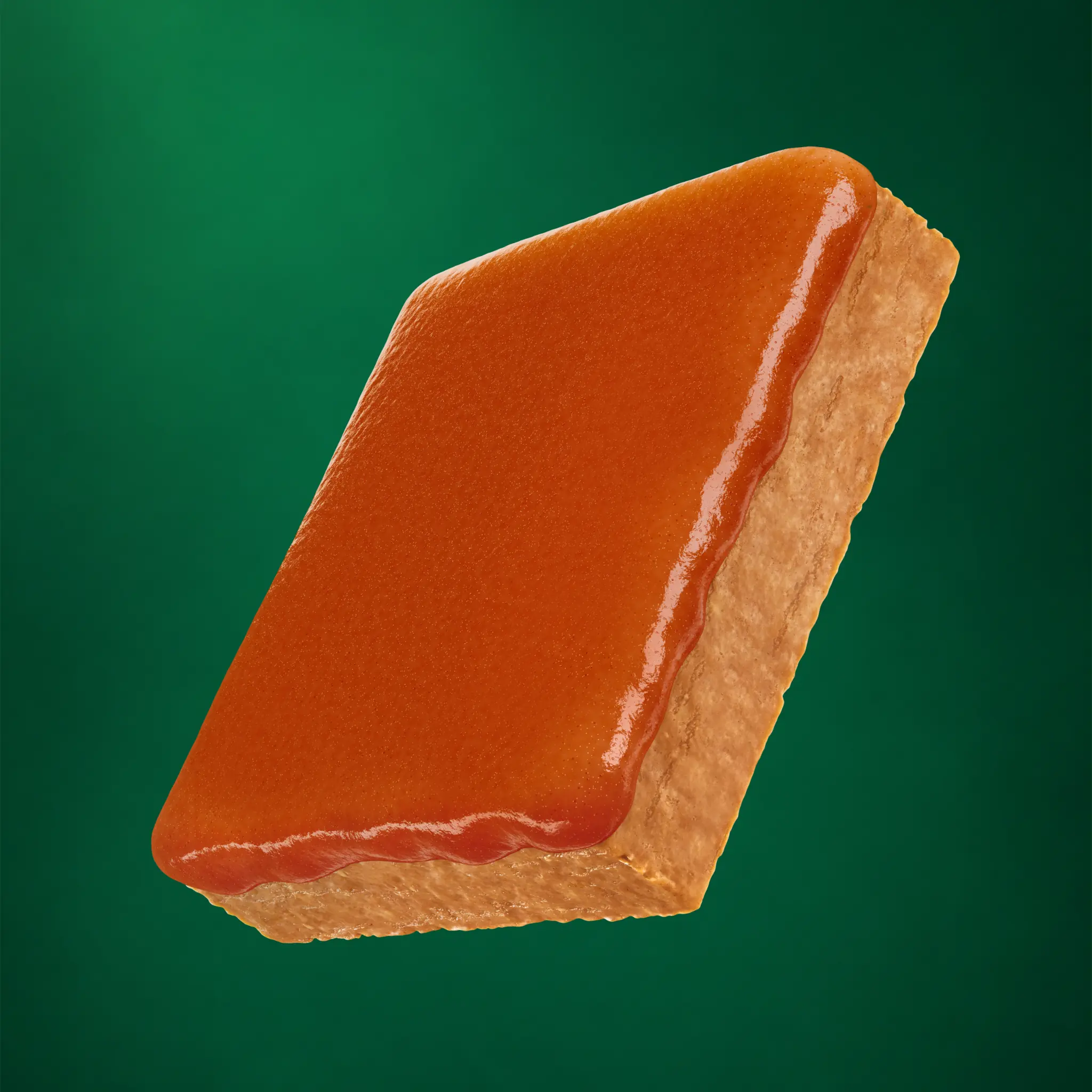
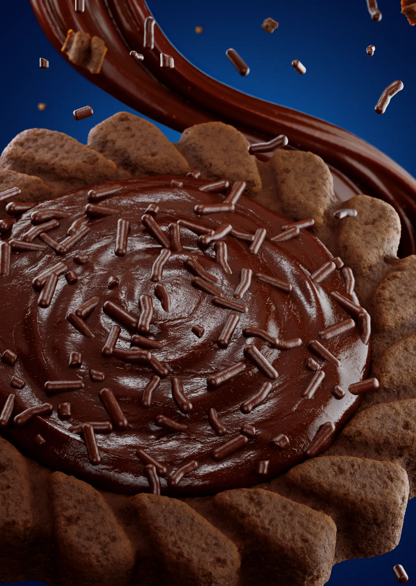
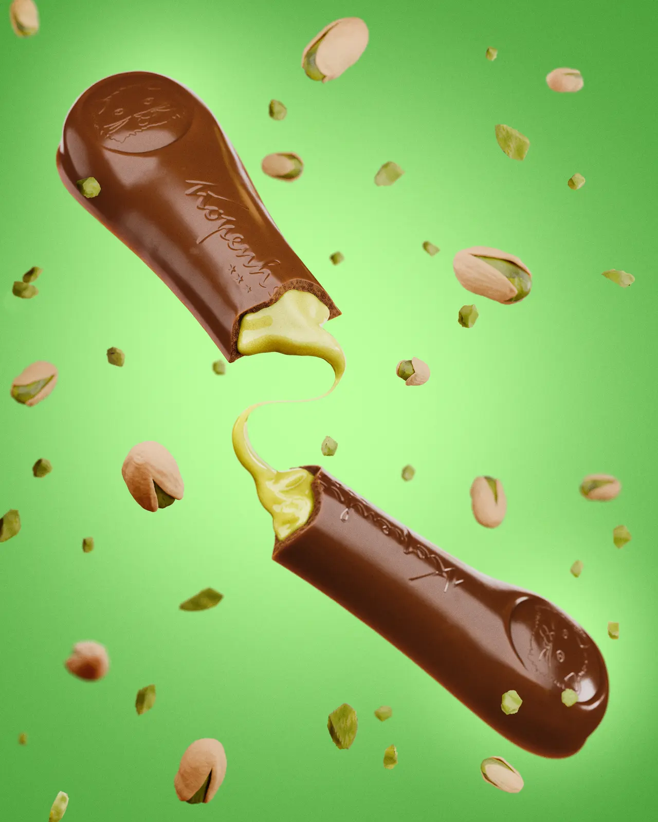
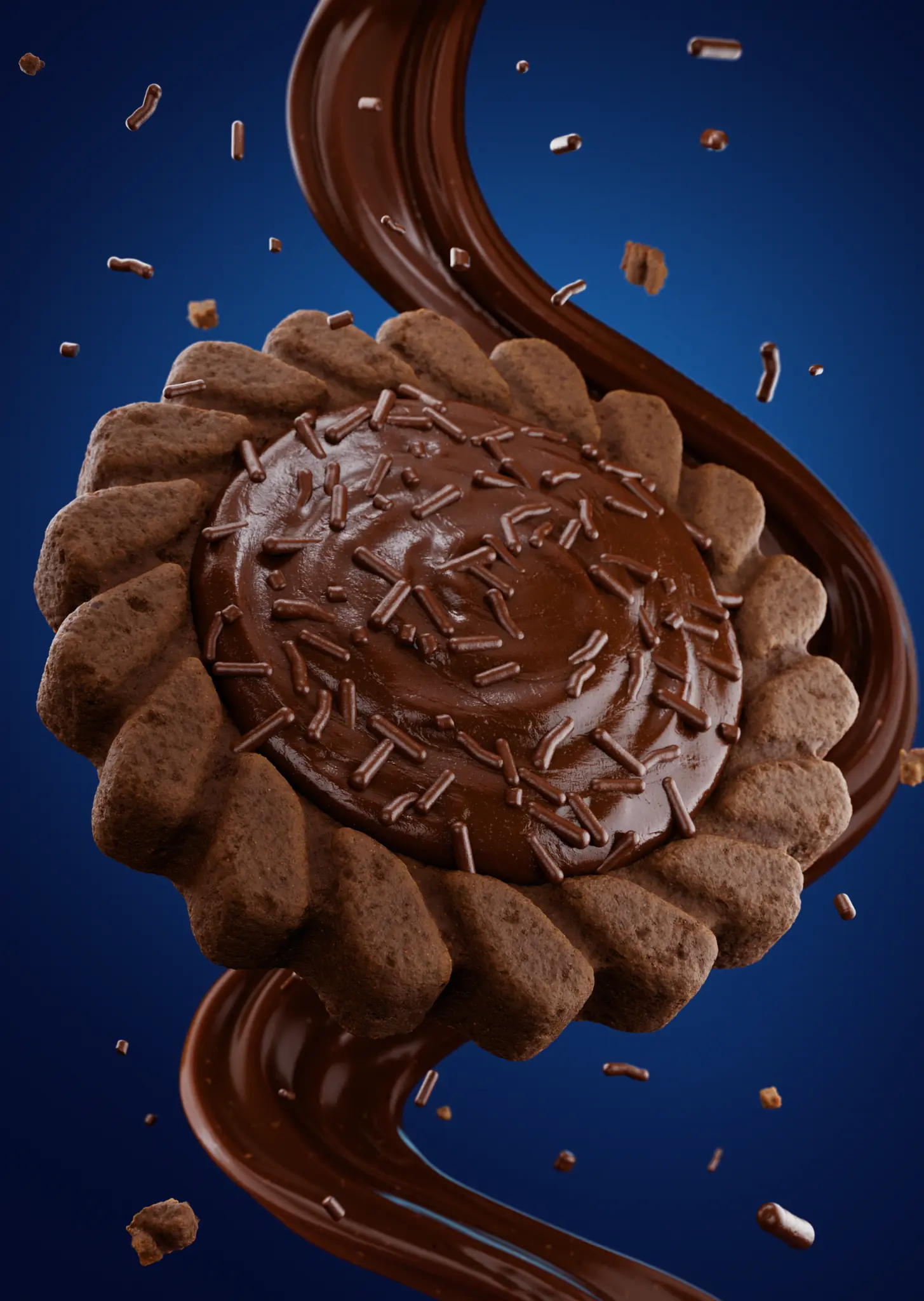
The product examples in this article come from selected GS Creative 3D food CGI projects.
The digital shelf changed the role of product imagery
Online, the package is not presented alone. It appears beside dozens of other options in search results, categories, grocery apps, marketplaces and advertisements. Often, the first contact happens before the customer reads the complete product name or description.
This creates a specific condition for CPG imagery: it must be recognizable quickly, but it must also withstand closer evaluation once the customer enters the product page.
A useful image should answer a few basic questions visually. What is the product? Which flavour or variant is it? Does the package look faithful to what will be delivered? Does the product feel appetizing and coherent with the brand promise? Is there enough information to keep exploring the page?
A composition can be sophisticated and still fail these tests. If the product is too small, the background competes with the package or the flavour is difficult to understand, the image loses its value at the moment it should be reducing uncertainty.
A beautiful render is not automatically a useful e-commerce asset
A campaign image is often built to create atmosphere, desire and differentiation. It may use dramatic composition, moving ingredients, unusual framing or a more conceptual art direction.
A product-page image has another responsibility. It must preserve product clarity while communicating quality and appetite appeal. That does not mean abandoning creativity; it means organizing creativity around the way the image will actually be seen and used.
A useful e-commerce render usually combines five qualities:
- Immediate recognition: the product and package remain identifiable in a thumbnail.
- Fidelity: shape, proportions, colours, label and finish match the approved product.
- Visual hierarchy: the eye understands the product first, then flavour, detail and context.
- Small-screen legibility: contrast, scale and silhouette continue to work on mobile.
- Flexibility: the same asset can produce different crops and versions without losing consistency.
Build an image set that answers different product questions
For many food products, one main image is not enough. It may present the package, but it will not necessarily show texture, scale, filling, portion or how the product is meant to be enjoyed.
A stronger gallery gives each image a clear job. The primary view should establish recognition before atmosphere. A detail view can show layers, coating, crunch or filling that the package cannot explain. A scale or context image can make a small product feel concrete. A family view can show several variants without making them indistinguishable. A use image can connect the product to a real consumption moment.
The gallery should balance desire, information and confidence. Not every frame needs to behave like a campaign key visual, and not every image needs to show the product in isolation. What matters is that the set helps the customer answer the questions that remain after the first glance.
3D makes this structure easier to plan because the product, camera, materials and surrounding elements can be controlled as one system rather than rebuilt from scratch for every view.

Where 3D product rendering helps CPG brands
The main advantage of 3D in this context is not simply producing images without a photo session. It is creating a controllable digital product that can generate different views from the same reliable base.
That becomes valuable when a brand needs to show the same product from several angles, adapt a crop for different retailers, present a closed package and an opened product, create flavour or format variants, or keep lighting and proportions consistent across a range.
The same system can also support closer texture crops, banners with negative space, retail modules, launch materials and social adaptations. Instead of commissioning an unrelated image for each need, the brand can build a visual foundation that supports a family of purposeful assets.
This does not remove the need for art direction. It makes art direction more important: from the beginning, the team has to define what information each view needs to communicate.
Design for the size at which the image will be seen
An image can feel balanced on a large monitor and lose its impact when reduced to a thumbnail. That is why approval should not happen only on the high-resolution file.
At minimum, test the image as a search or category thumbnail, as the main product image on a phone and as an enlarged view inside a gallery or content module.
In the thumbnail, silhouette and primary colour help recognition. On mobile, the product needs enough scale without losing breathing room for the interface. In the enlarged view, materials, texture and finish can take on more importance.
This review also helps determine whether the background should be neutral, colourful, contextual or transparent. The best choice is not the most striking in isolation; it is the one that keeps the product legible inside the environment where it will appear.
Visual accuracy is also a question of trust
The appeal of an image cannot be separated from product accuracy. A package with incorrect proportions, a colour that changes from one view to another or a filling shown more generously than the real product can create an expectation the product does not support.
For a CPG brand, that affects more than aesthetics. It affects perceived quality and the consistency between package, product page, advertisement and shopping experience.
3D offers control, but control is useful only when the foundation is correct. Before production, confirm the product dimensions, the actual package structure, the approved artwork, colours and materials, the appearance of edible elements and the real differences between flavours or SKUs.
A commercial image can be seductive while still respecting the product. That combination matters especially when the image becomes the main reference for a purchase made without physical contact.
Prepare a brief for e-commerce rendering
A useful brief does not need to dictate every camera and lighting decision. It needs to clarify the work the image must perform.
Before production, the brand should define the channels where the images will be used, the required formats and proportions, the primary view, the information that must appear at first glance, the details to explore in the gallery and the elements of the product that cannot change.
It is also worth defining where space is needed for copy or interface, how visual fidelity will be approved, and which versions and source files are expected at delivery.
This clarity prevents the production from becoming limited to one attractive but operationally weak image. The asset is planned around the real digital shelf rather than adapted to it at the last minute.
- Which products, flavours or variants are being visualized?
- What must remain accurate: proportions, package artwork, ingredients, colours and materials?
- What should the viewer understand or feel first?
- Which formats, channels and interface contexts need to be supported?
- Who gives feedback, who consolidates it and who gives final approval?
- Which views, resolutions, usage rights and source files are expected?
The right asset can keep working after the product page
Although this article focuses on e-commerce, the same 3D product asset can support retail modules, advertisements, sales presentations, launch materials and social adaptations.
For that to happen, the asset needs to be built for reuse. Geometry, materials, textures, packaging and variants should remain identifiable and editable inside a coherent system.
The goal is not to produce endless images without a reason. It is to prevent every new channel from forcing the brand to rebuild the product visually from zero.
A strong product asset therefore becomes more than a final render. It becomes a controlled visual source that can respond to new crops, new formats and new commercial needs while keeping the product recognizable.
The best e-commerce image starts before the render
The quality of a product page does not depend only on file resolution. It depends on an earlier decision: understanding what the customer needs to recognize, desire and confirm before buying.
For food and CPG brands, 3D product rendering can turn a physical product into a clearer, more consistent and more adaptable set of images for the digital shelf. The strongest result is not necessarily the most dramatic one. It is the one that continues to work when the package is small, when the customer changes screens and when the range grows into new flavours and formats.
That is where CGI stops being only a way to present a product and becomes part of how that product is found, understood and chosen online.
Before developing that visual system, read What CPG Brands Need to Prepare Before Starting a 3D Product Visualization Project.
Frequently asked questions
What brands usually ask before starting.
Is 3D product rendering useful only for large e-commerce brands?
No. Smaller brands can benefit when they need to present a new product before building a full photography library or when they need consistent images across several channels. The scope can begin with a primary image and expand as new needs appear.
How many images should a CPG product have on its product page?
There is no single number. The set should cover the customer's most important questions: package recognition, product appearance, texture, scale, variety and consumption context. A purposeful gallery is more useful than a long collection without clear functions.
What is the difference between a campaign render and an e-commerce render?
A campaign render usually prioritizes impact, atmosphere and positioning. An e-commerce render should preserve those qualities while giving greater priority to recognition, clarity, accuracy and legibility on small screens.
Can the same 3D model create images for different retailers?
Yes, provided the asset is built accurately and organized to support different cameras, backgrounds, crops, proportions and package versions. The technical requirements of each channel should be confirmed early.
Should an image with ingredients or an opened product replace the main product image?
Not necessarily. These images are useful for showing texture, flavour and use, but the main image usually needs to identify the product and package quickly. The strongest result is normally a gallery in which each image has a different job.
Building a stronger product page?
Create a visual system for the digital shelf.
GS Creative 3D helps food and consumer brands turn product details, materials and commercial goals into clear CGI visuals built for e-commerce and real-world reuse.
Discuss your next launch